


My Role
User Interface Designer
Primary Stakeholder
CareerFoundry - UI for UX Designers
Tools
Miro, Figma
Background
Designing a place for remote learners who crave connection.
What if studying alone didn’t have to feel lonely?
That was the central question I aimed to answer with StudyTogether, a responsive web app designed to connect students for peer-to-peer learning. This web app needed to be more than just a platform; it had to feel like an engaging community. The goal was to design a friendly, responsive user interface where students don’t feel like they’re studying alone, where they can stay motivated, connected, and supported throughout their learning journey.
Understanding the Challenges Faced by Remote Students
Meet Alex Rivers, our primary user persona. He’s a student enrolled in an online course and works part-time as a retail store manager. Like many learners, he’s passionate about his subject but often feels isolated, making it difficult to stay motivated or engage meaningfully with his peers outside of structured classes.
He’s looking for:
Relevant study materials and tips to tackle complex topics
Peer feedback on assignments before submission
Connections with like-minded peers for support and collaboration
Understanding Alex’s motivations, frustrations, behaviors, and context helped shape the design process. His need for flexibility and meaningful connection became the foundation of the UI strategy for StudyTogether.
“I love the idea of having the right support at the right time for my course.”
“I think teamwork will be key to my professional development.”
Planning the Path First to Build Flows that Keep Students Focused
Before diving into visuals, I focused on clarity and functionality. I refined the user flows based on key user stories: creating an account, finding students with shared interests, messaging, sharing content, and giving or receiving feedback.
I mapped out the app’s core structure in a user flow diagram to ensure seamless navigation. Each path was designed to minimize cognitive load and keep students like Alex focused on learning, not figuring out how to use the app.
Sketching the Vision: Prioritizing What Matters Most on Mobile
With the flows in place, I began sketching paper wireframes for mobile screens. Starting mobile-first ensured the most critical elements were prioritized. I focused on key features like onboarding, content sharing, connecting with peers, and browsing the feed.
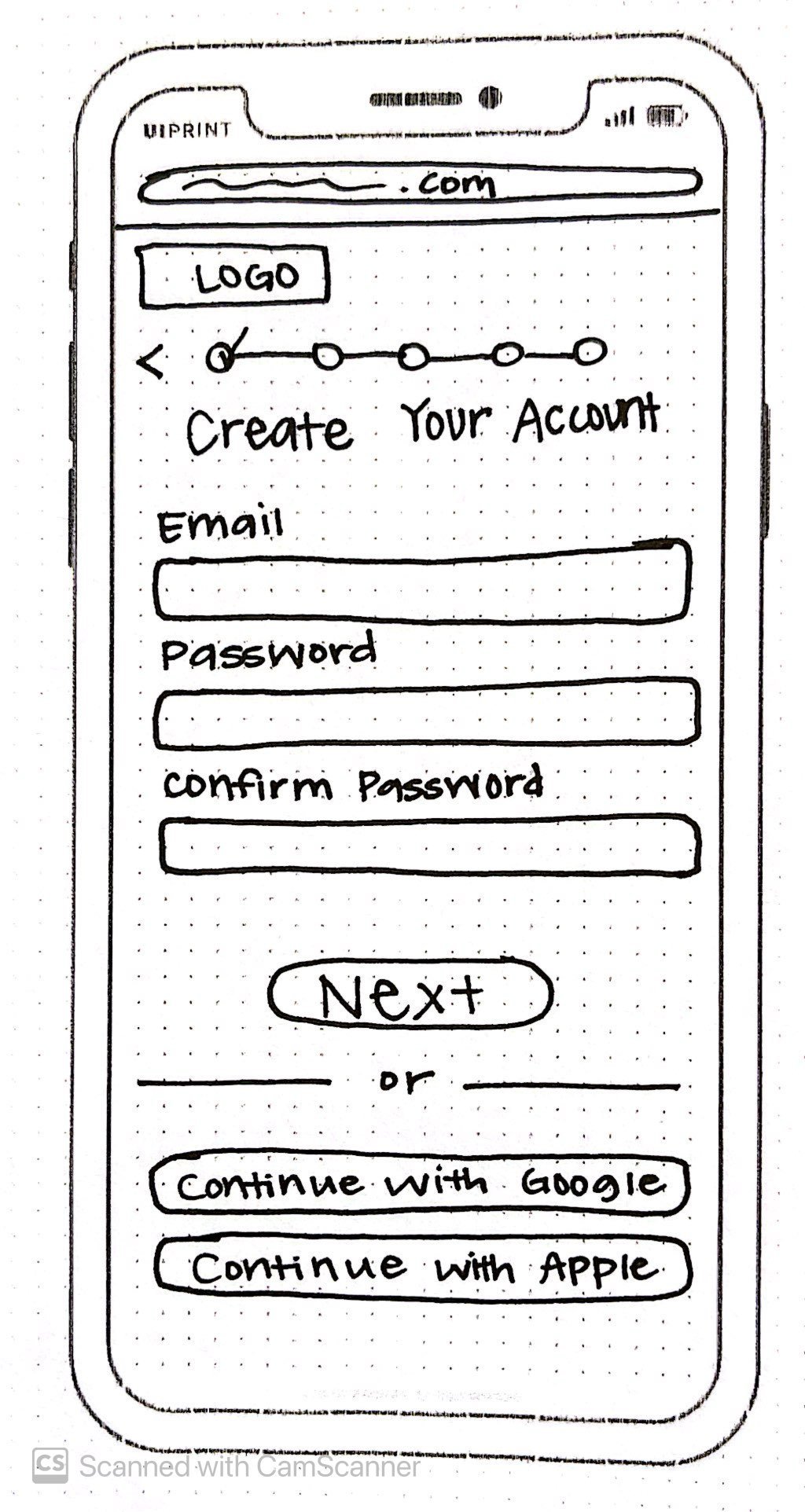
Onboarding process- HMW help students easily create profiles?
Challenge:
How can we design a comprehensive onboarding process that encourages students to create profiles and connect with like-minded students?
Solution:
A guided onboarding flow walks new users through setting up a profile with subjects, specializations, and study interests. This will help students find, connect, and collaborate with relevant peers.


Challenge:
How can we create a space where students can easily share information and resources?
Content Sharing- HMW design an intuitive way for students to exchange knowledge?
Solution:
A content-sharing feature allows students to post images, articles, videos, and other academic materials in a structured format. Engagement tools like reactions and commenting encourage discussion, fostering a supportive community.


Search Function- HMW help students find and connect with like-minded peers?
Solution:
A subject-based discovery feature lets users filter by subjects or location, view relevant student profiles, and connect through messaging. This encourages meaningful connections from the start.
Challenge:
How can we make it easy for new users to find and connect with students who share their academic interests and goals?


From Rough Frames to Refined Journeys: Structuring for Usability
I transformed low-fidelity wireframes into mid-fidelity digital wireframes and finally high-fidelity wireframes. I concentrated on establishing a clear structure, refining the content hierarchy, and defining key interactions, ensuring a logical flow while enhancing usability.

Before:
Users hit friction with too many input fields and confusing steps upfront.

After:
Streamlined the post flow, focused on the caption first, and removed unnecessary fields.
Before:
Profile details cluttered the home screen, distracting from the content feed.

After:
Moved profile to its own screen, keeping the home screen feed clean and focused.
Crafting a Visual Language of Growth, Warmth, and Connection
I established a visual direction to embody community, warmth, and collaboration.
To reinforce these values, I selected green as the primary color, representing growth and creating a welcoming and motivating learning environment for users to engage and connect.
Design in Motion
To enhance the experience further, I began to incorporate interactions, using motion and feedback to guide users and reinforce system status.
The Final Transformation: Designing a Clear Experience
After developing a brand icon and a set of simple, clear icons to support navigation and clarity. The high-fidelity mockups for mobile brought everything together, including color, typography, spacing, and iconography, to build a cohesive and welcoming interface.

As a new user, I want to create a profile, so that other students can find me.
As a new user, I want to find and connect with students studying my subject (or a related subject), so that we may collaborate.
As a frequent user, I want to be able to message other students, so that we can problem-solve together.
As a frequent user, I want to be able to view and share articles, videos, images, and other files, and write posts for other students to read, so that we can share knowledge.
The Final Mobile Prototype: Where Brand and Function Meet
Good UI design isn’t just about how it looks, it’s also about how it functions!
I built an interactive prototype to simulate key user journeys. I paid close attention to microanimations, such as liking a post, swiping between screens, or button states, ensuring they felt responsive and intuitive to improve the overall interaction experience.

Adapting for All Devices to Support Learning on the Go
Since students like Alex use various devices, responsive design was a priority. I expanded the UI with low-fidelity wireframes and final mockups for tablet and desktop breakpoints. I adjusted layout components to use the larger screen real estate while maintaining a consistent visual design.
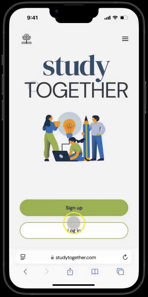
Landing Page


Home Screen


Search Results


From Design to Build: Preparing for Smooth Handoff
For handoff, I prepared a comprehensive style guide and handoff package with the interactive prototype, design specs, exported assets, and UI mockups for developers. This process taught me the importance of clearly communicating the design intent and organization.


Reflection
This project taught me the power of effective UI design in creating meaningful digital spaces. I learned how to:
Prioritize responsiveness from the beginning
Align visual design decisions with user emotions and goals
Keep interactions simple and intuitive yet engaging
One challenge I faced was balancing social features with usability. It was important not to overwhelm users, so I focused on clean and consistent layouts, progressive disclosure, and a visual hierarchy that guided users to accomplish their goals without distracting them.
StudyTogether is not just a web app; it’s a community that encourages and motivates students. Through clear user flows, responsive design, and a welcoming visual language, the final product supports students by making connections and collaboration accessible.
